Menu
Jump to:
The goal
Mitigate school churn following the end of National Tutoring Programme funding by demonstrating the measurable impact of MyTutor’s online tutoring programmes
Project duration
January – August 2024
My role
Product Designer
Responsibilities
User research/Wireframing/Prototyping/User testing
The challenge
At MyTutor, we work with schools nationwide, helping them use their National Tutoring Programme (NTP) budget to provide tailored tutoring support for their students. With the end of the NTP, we’ve seen some schools churning. Our exit surveys indicate that schools often cite lack of funding as the primary reason. However, our qualitative research shows that when schools can clearly see the impact of MyTutor’s programmes, they might be able to find or reallocate funds. Our challenge was to address this gap and demonstrate that the issue may not be solely financial.
On top of that, the school platform had been built on a legacy framework, which made it difficult and time-consuming for developers to make updates or implement new features. I had to ensure that we worked within those technical restrictions, making minimal UI adjustments while maximising the impact of UX.
Target audience
School teachers who are responsible for overseeing the National Tutoring Programme (NTP) initiatives, specifically the Programme Leads. These educators are often decision-makers themselves or have the ability to influence the decision-makers, such as school heads and MAT leaders, who ultimately determine the effectiveness and continuation of tutoring programmes within their institutions.
How might we present health metrics to teachers in a way that clearly demonstrates the impact of MyTutor's online tutoring programmes?
Understanding the user: pain points
MyTutor has a great research library, which I explored to understand how schools think about impact and what specific metrics are most important to them. I focused on what really matters to them and how we’ve communicated this in the past.
I also interviewed Programme Leads to learn how they actually use the data we provide and how budget decisions are made at their schools. This combination of user interviews and existing research gave me a much clearer picture of the real challenges they’re dealing with.
Lack of time
Programme Leads are stretched thin, managing their primary school duties while overseeing the tutoring programme. Similarly, tutors juggle multiple commitments, leaving them with little time to devote to reporting. Both user groups needed a straightforward process that would reduce friction and save time, allowing them to focus on what truly matters.
Real-time metrics
While improvements in pupil grades are vital, they only become visible at the end of the academic year.
Teachers need more immediate, actionable metrics to gauge progress and make adjustments throughout the year.
Inconsistent reporting
Tutors sometimes leave their reports incomplete or fail to submit them within the recommended 24 hours, creating gaps in the information. This lack of consistency makes it hard for Programme Leads to get a clear picture of how engaged pupils are and how well the sessions are working.
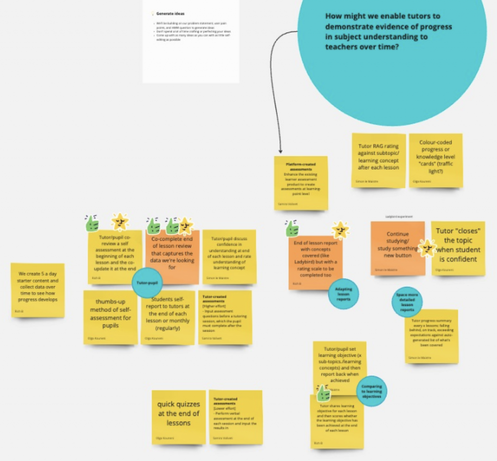
Ideation workshop💡
To address the pain points we uncovered, I brought my team and key stakeholders together for an ideation workshop. Our aim was to brainstorm potential solutions that aligned with our business goals and set a clear path forward.
One of the key issues we discussed was the inconsistency in tutor reports. Tutors, juggling other commitments, often didn’t complete their reports, and when they did, the free-text format didn’t always provide valuable insights. This left Programme Leads without the necessary information to track pupil progress effectively. We knew we had to make the reporting process simpler, quicker, and more structured for tutors, ensuring better consistency and relevance.
We also agreed that including actionable data points in tutor reports was necessary to give Programme Leads the detailed information needed to assess both the impact of each lesson and the programme as a whole.
Given the wide range of subjects and levels covered by tutors, we decided to start with the most in-demand lessons: GCSE Maths, English, and Science.
We used the impact-effort matrix to evaluate each potential solution, with the lead developer’s input helping us weigh the potential impact against the effort required to implement each idea.
The process: tutor reports
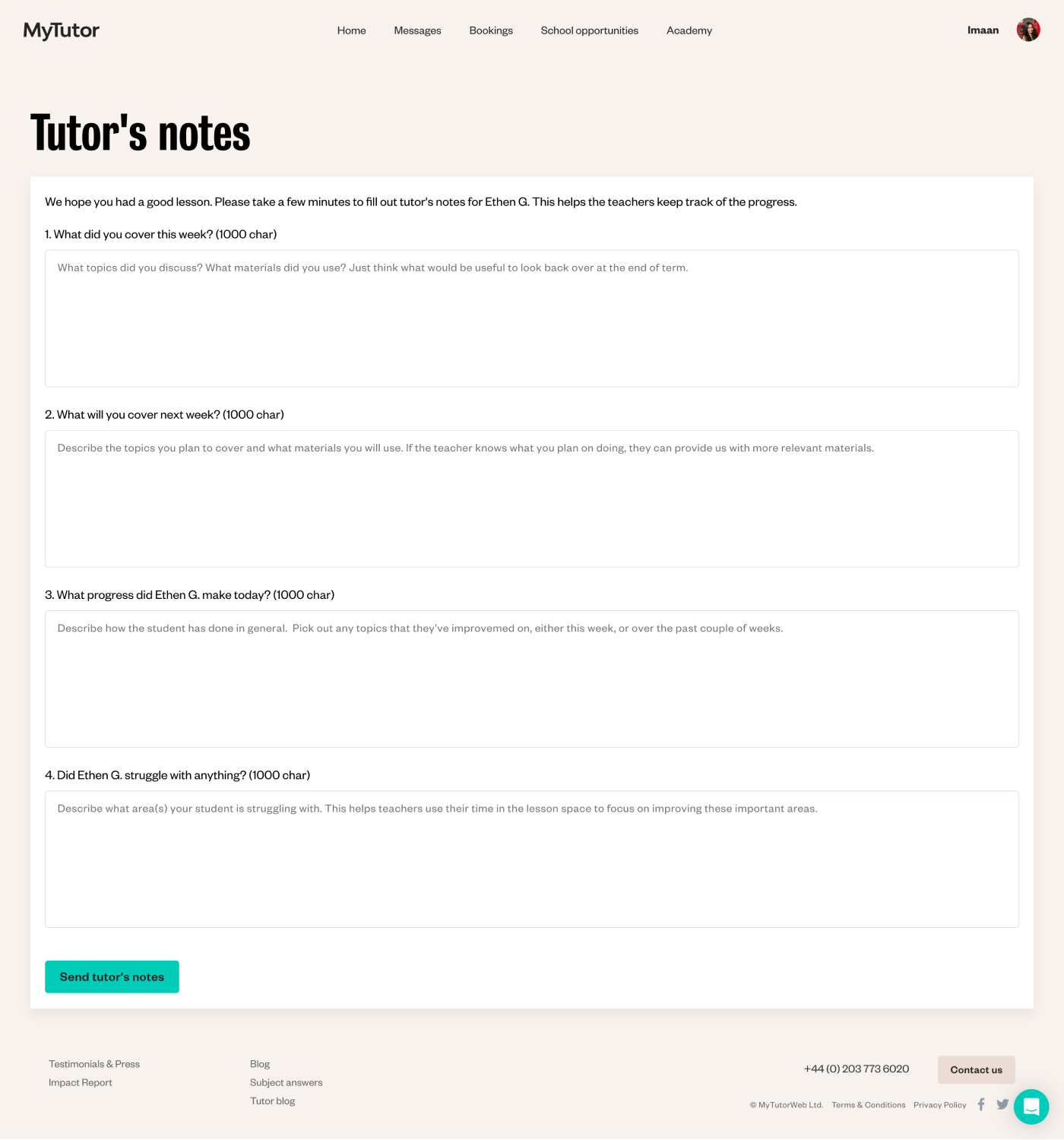
We needed to update the tutor reports to introduce new data points, such as topics covered, concepts mastered, skills practised, and pupil engagement, which would then be reflected on the teacher dashboard. These reports were previously called Tutor Notes, a name that made them seem less important. To emphasise their significance and encourage tutors to take them more seriously, we renamed them Lesson Reports.
Before:
The old reports relied on free-text entries, which brought challenges to both tutors and Programme Leads.
Tutors often found it frustrating and time-consuming to remember and describe everything covered in each session.
For Programme Leads, the unstructured feedback made tracking pupils’ progress more difficult.
Plus, without meaningful data points, MyTutor struggled to demonstrate the impact of our programmes back to schools.
After:
Instead of open-ended text, we introduced a much simpler, structured format.
Now, tutors select from a list of topics and concepts they covered during the lesson and rate how well pupils mastered each one. This new structure allows teachers to track progress over time.
We also introduced key data points like pupil engagement, skills practised, and plans for the next lesson.
The updated reports are more structured, less intimidating, and quicker to fill out. They remove guesswork and provide much more valuable, actionable insights for both schools and MyTutor.
Usability testing
Before we rolled out the new report format, I created a prototype and tested it with over 20 tutors, gathering their feedback on what worked and what didn’t. The response was overwhelmingly positive: most tutors appreciated how easy it was to use and found the knowledge ratings particularly helpful.
Options for pupil's level of understanding from 1-3 are useful when repeating topics in the future.
I like how you can say how the student got on with each individual topic area.
The student engagement and the skills section were great, as well as the next session section.
How we measured success
The original reports had an overall completion rate of 89%, but those with over 15 characters in each section (which held more value) were at 78%. With this in mind, our goal for the new format was to ensure that the completion rate didn’t drop below that number.
After monitoring the reports for several weeks, we were pleased to see that the completion rate of our new format reached an impressive 94%! 🌟
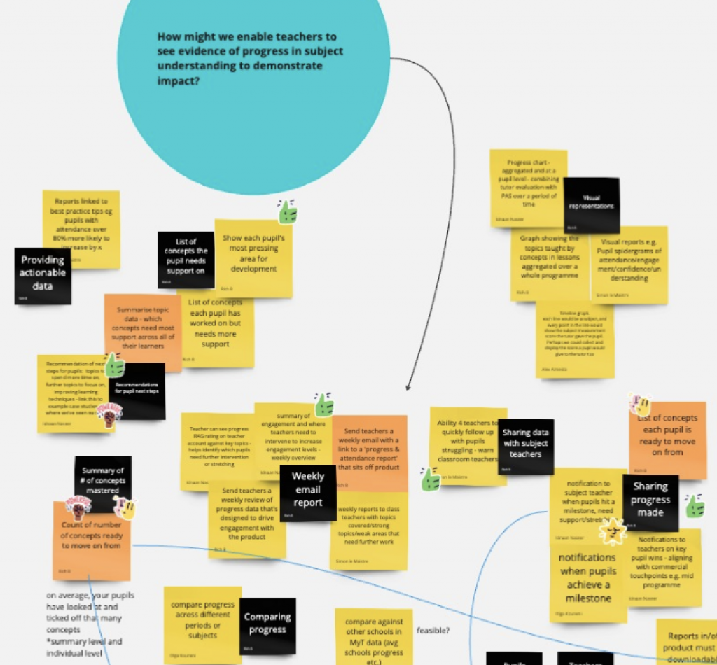
The process: teacher dashboard
While designing and testing the new tutor reports, I was also working on updates to the teacher dashboard, making sure the new data points we were collecting were clearly displayed so schools could better see the impact of our tutoring programmes.
Since I had already interviewed teachers and reviewed the existing research, I had a clear sense of what they needed, how they tracked progress and what data mattered most.
I started by identifying issues on the pupil’s page that hindered teachers from effectively tracking progress. Aside from challenges like free-text tutor feedback, I found several other problems. The filters for navigating multiple programmes were slow and not user-friendly, making it hard for teachers to quickly access the programmes they needed. The layout wasn’t making the best use of available space, and active and past programmes were mixed together, making it hard to distinguish between current and past programmes.
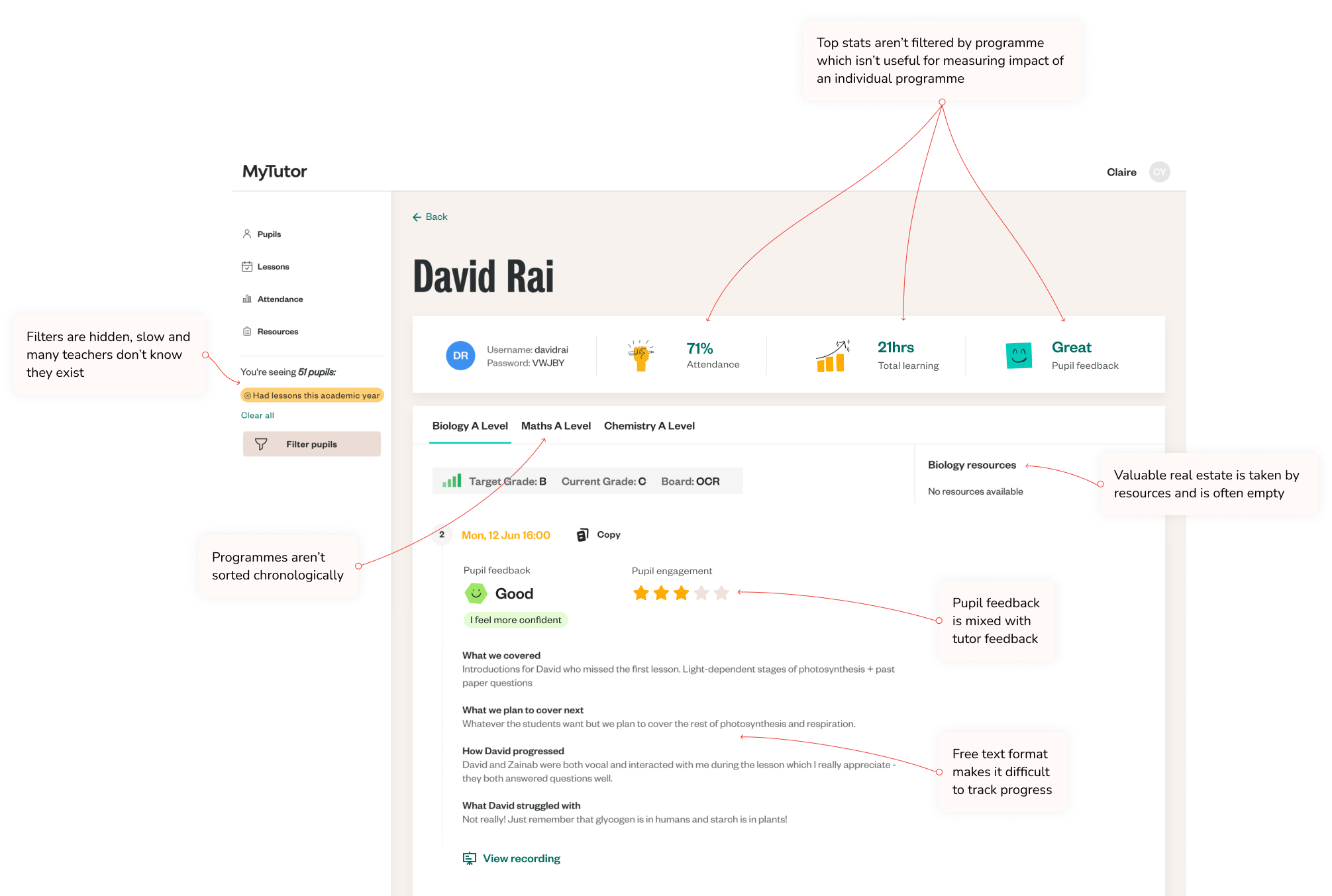
Working closely with the developers, we identified the reasons why the headline stats weren’t accurately reflecting the real-time data for each programme. After resolving those issues, we created a new logic that allows teachers to instantly access key information for each subject and level, offering a quick overview of what matters most.
I visually separated active programmes from past ones and worked with the developers to ensure that teachers land directly on the programme that had the most recent lesson, addressing their need to quickly access the most current information without extra effort.
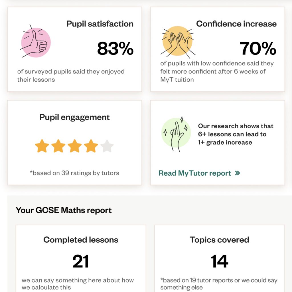
From my conversations with teachers, it became clear that RAG ratings are the most commonly used method within schools for assessing knowledge. So, we translated our tutors’ assessments into RAG ratings on the teacher dashboard.
One of the most impactful changes to the pupil’s page is the pupil progress widget, which allows teachers to track grade progress, the number of lessons taken, topics covered, and concepts mastered. This feature offers invaluable insights into each programme over time.
While working on the teacher dashboard, I had to consider the platform’s limitations. The system had been built on a legacy framework, which made it tricky for the developers to build new components. To keep development manageable, I adapted the existing UI to align with what was already there, working closely with the product manager, lead developer, and the rest of the dev team to introduce the necessary improvements without overcomplicating the build.
Our aim was to enable teachers not just to track individual pupil progress but to assess performance on a cohort or even a school-wide level. To support this, we added new data points across key areas of the platform—such as the pupils and lessons pages—and made sure these could be easily filtered.
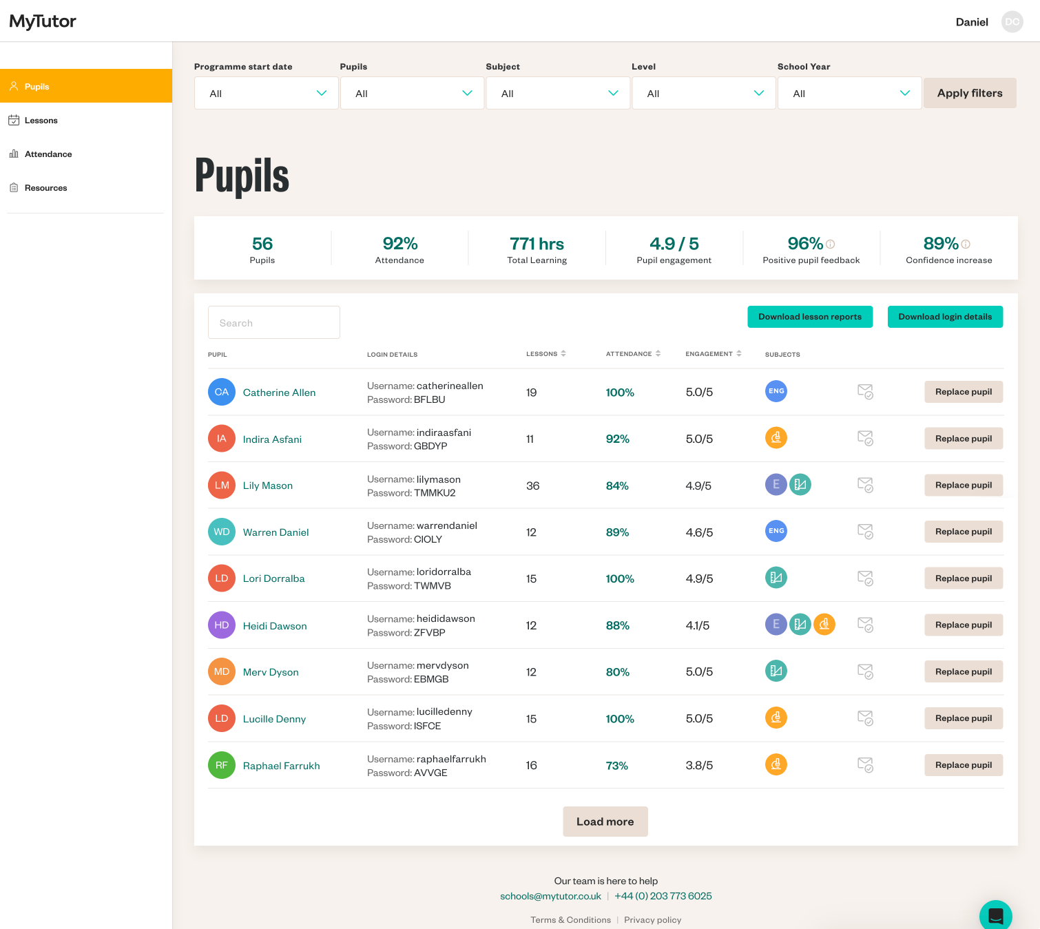

One significant update was moving the filters from the sidebar to the top of the page, which wasn’t just a UI improvement – it also improved how teachers accessed essential data quickly and intuitively. Next, we refined the filter logic with the developers, enabling teachers to retrieve granular data, like a specific cohort’s attendance or a particular year group’s engagement, with just a few clicks.
We also introduced sorting options on the pupils table, allowing teachers to organise information by lessons, attendance, or engagement. This made it easier to spot trends, such as sudden drops in attendance or engagement, so teachers could respond swiftly.
With these updates, teachers could easily access the new features and gain a clearer understanding of their school’s tutoring impact at the individual pupil, cohort, and school levels, all without needing to navigate a completely new interface.
Impact
44%
increase in teacher satisfaction
with the evidence of impact
20.51%
increase in lesson report completion rate
10x faster
teacher report page loading time
Final Thoughts
This project has been an engaging experience that required us to address the unique needs of various user groups. Understanding the perspectives of teachers and tutors pushed me to constantly shift my own perspective.
We worked closely with our B2B stakeholders who were responsible for different aspects of the business, ensuring our team stayed aligned with broader business goals.
Research played a crucial role in guiding us at every stage, helping us refine the reports to fit different levels and subjects. We also had to think ahead about how the system would handle more data as it scaled. Balancing the best outcomes for user groups with what the developers could realistically implement was essential.
One of the most exciting outcomes was how the changes resonated beyond the platform’s core functionality. After seeing the results, the sales team asked me to create a prototype of the teacher account, which they are using to support both acquisition and retention efforts. It was rewarding to see the impact of our work on both the users and the business.
Looking back, I feel a strong sense of accomplishment. Witnessing the positive effects of our efforts on users and the business has been truly rewarding.
hello@olgakouneni.com
© All Rights Reserved 2024