OK Logo

Building an online presence for a designer jewellery brand

Jump to:

The goal

To develop visual identity and e-commerce website for an online shop of contemporary jewellery from independent Greek designers – that will support the brand’s values of craftsmanship, sustainability, and rich Greek history while winning new customers

Project duration

September – December 2020

My role

UX Researcher/UI Designer/Graphic Designer

Responsibilities

Visual identity development/

User research/Wireframing/Prototyping

The challenge

Being a new brand in a very saturated jewellery market, Etherea Gallery needed to stand out. Not having brick and mortar locations and planning to exclusively operate online, it was crucial for the new website to promote trust, positive perception, and brand awareness.

So how might we be able to create an online experience that can be as valuable as the in-store experience?

Understanding the user: pain points

Lack of information

When browsing for jewellery online users often face uncertainty when it comes to product description and company information. It is hard to make a buying decision when crucial information is missing, so it’s important to have clear descriptions and easy access to any information that might be useful.

Poor photography

Often, when shopping with smaller or unknown brands, users are hesitant to make a purchase due to the poor quality of product photos. To make a strong first impression as well as to provide maximum information about a product, we need high quality, professional photography.

Complicated checkout

Online shopping has become not only more popular but more effective and personal than ever. Going through complicated and lengthy checkout process simply does not work anymore. It is important for the checkout flow to be as clear and simple as possible.

Based on our research findings, we had a clear understanding of the three main customer profiles Etherea will be serving. To help us better understand what their customers need and represent their goals and behaviours, I created user personas.

Competitive audit

To discover what works and what doesn’t for other companies and incorporate those strategies for Etherea, I identified my client’s key competitors and reviewed the products they offer. What do they do well? Can we do it better?

The biggest takeaways:
  • A professional, responsive website is the key to making the first impression a good one and establishing trust
  • In order to enhance customer experience and maximise sales, successful brands use product videos along with high quality photography
  • In order to build customer loyalty, most competitors offer incentives such as free shipping for spending above a particular threshold, discounts, or gifts

Information architecture

Sitemap

We wanted to create a seamless and intuitive navigation providing maximum convenience and transparency to the user.

After careful consideration and discussion with stakeholders, it was decided to go with the main four categories as well as Discover tab for a quick access to particular collections. 

A photo of several paper wireframes and pens and pencils laid out on the desk
A photo of me drawing a paper wireframe for a product page
A photo of a Product page paper wireframe
A photo of several paper wireframes for the desktop Etherea Gallery website
Paper wireframes

Based on my research findings and the project goals, I created paper wireframes of the main pages, combining the most important elements together and establishing the basic structure of the website.

Having the logotypes of the magazines Etherea Gallery has been featured in at the top of the page increases trust and encourages browsing.

The embedded Instagram feed at the bottom of the page provides a little sneak into the brand’s Instagram presence while the featured items carousel allows the user to browse through a set of items that can be easily updated in the admin panel.

Digital wireframes

Wile I was set on the main elements like hero image, featured items, and Instagram feed, I was still exploring different ideas of organising and displaying the main categories.

Here I am playing with the idea of a large, bold image on one side accompanied by description on another. Later on, after the usability study, I came up with a different way of organising them.

A screenshot of home page wireframe for mobile

Usability study findings & insights

As our goal was to provide a consistent experience with every visit and transaction, we focused our study on navigation and ease of checkout flow.

  • Users need to be able to instantly find product categories
  • Users need to see offers and shipping info without searching for it
  • Users find the existing product page layout efficient
  • Most users were confused when they needed to use a voucher code

Refining the design

Colours

I aimed to establish a brand identity that exudes modernity and sophistication, ideally suited for a high-end designer jewellery shop. To achieve this, I opted for a black logo on a white background, and an overall concise and minimalist aesthetic that provides a striking contrast, thereby enhancing the visual appeal of the products. The use of light grey to showcase the jewellery pieces adds an elegant touch, effectively highlighting their unique and high-quality designs. The contemporary and stylish colour scheme perfectly reflects the premium quality of the jewellery on offer.

Etherea Gallery designer jewellery logo
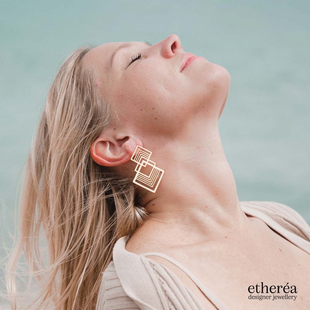
When creating the logo, I aimed for a concise and modern appearance that would not only look great on the website and across social media but also on packaging and promotional materials. The logo needed to be versatile and adaptable to different contexts, conveying a sense of luxury and sophistication that would resonate with the target audience.
By prioritising a sleek and minimalistic aesthetic, I was able to create a powerful visual symbol that effectively communicates the brand’s commitment to quality and elegance..
An image of woman's hands hugging a man while wearing multiple Etherea Gallery rings
An image of a woman wearing Etherea Gallery necklace on her back
An image of a woman wearing Etherea Gallery necklace on a beach
An image of Etherea branded jewellery box with two rings in it

Brand aesthetics

Based on usability study findings, I created a modern, sleek website with a luxurious feel.

I added a notification panel at the top of the page to quickly add free shipping info or discount alerts.

I strategically placed CTA buttons to guide users to the goal conversion.

Working closely with the photographer, we produced high quality, unique imagery that I used throughout the website.


Etherea Gallery Homepage
About Us Page
Product Page

Prototyping

Since Etherea Gallery used Shopify as their e-commerce platform, I prototyped and tested the design in Shopify, which provides full flexibility within its admin panel. 

Impact

36%

bounce rate, compared to the industry standard of 51%

4.3

pages per session

1.94%

conversion rate, compared to the luxury jewellery industry average of 1.19%

Final thoughts

Working with an emerging company on creating their brand identity and helping them establish their voice and place on the market is always truly rewarding. Collaborating with a team of photographers and developers to come up with innovative solutions and reach the ultimate result has been exciting and fulfilling.

Etherea Gallery website is an ongoing project as we continue improving and optimising the UX/UI  depending on customer feedback and analytics data.

hello@olgakouneni.com

© All Rights Reserved 2024