OK Logo

Transforming coffee ordering with a mobile app

The product

A mobile shopping app for an award-winning sustainable cafe/workshop in the heart of Richmond upon Thames with clientele ranging from young students to sophisticated professionals

Project duration

March – July 2022

My role

UX Researcher/UX Designer/UI Designer

Responsibilities

User research/Wireframing/Prototyping

The challenge
Situated on a busy high street, the coffee shop owners were still not using the opportunity to cater to busy professionals who don’t have time to wait in long queues and need their orders delivered quickly and efficiently.
The goal
To create a mobile application that would allow advance ordering and promote loyalty.
Target Audience
Students and professionals working in the local area
So how might we create a mobile app that would offer a smoother and faster experience than an in-person interaction?

Understanding the user: pain points

Long queues
Wasting time waiting in queues while orders are being prepared. This is a common frustration of busy professionals who work in the area. By providing an advance order/click & collect option, we could significantly shorten the waiting times.
Unhealthy options
Not having enough time to study the menu often results in hasty orders and unhealthy choices. Being able to study the menu in advance and choose the right options would increase customer satisfaction and loyalty.
Physical stamp card
My research has shown that even loyal customers don’t always carry loyalty/stamp cards on them due to inconvenience, therefore the digital stamp card option would be an excellent alternative to physical ones.
Persona 1
Persona 2

To uncover pain points and opportunities in customers’ daily lives, I developed personas and user journey maps based on research findings. This approach revealed how and when customers, both potential and existing, were being exposed to the company’s products.

Competitive Audit

To uncover potential market gaps and anticipate usability challenges, I analysed key competitors and their offerings.
What do they do well? How easy is it to complete a certain task? Are they solving the problem? Can we do it better?

Direct competitors:
Ole & Steen
Paul
Kiss the Hippo

Indirect competitors:
Knoops
Joe & The Juice

A screenshot of a spreadsheet page with extensive competitive research for the coffee shop mobile app
The biggest takeaways:
  • Most of competitors have very strong brand identity through the use of consistent colours, fonts, imagery, and voice tone
  • Most of the apps force sign up/login upon opening, which makes it impossible to use the app without logging in
  • The most popular app features throughout the competitors’ apps: Click&Collect, digital stamp card, reward programme, refer a friend

Wireframing

Paper wireframes
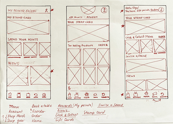
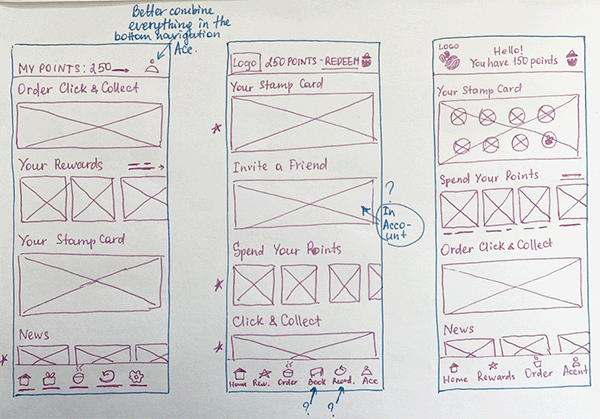
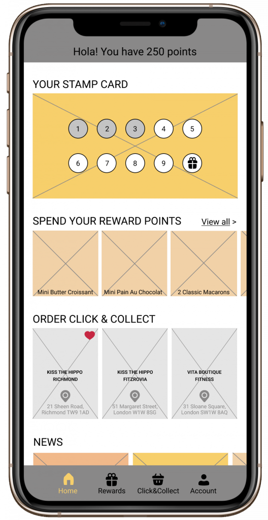
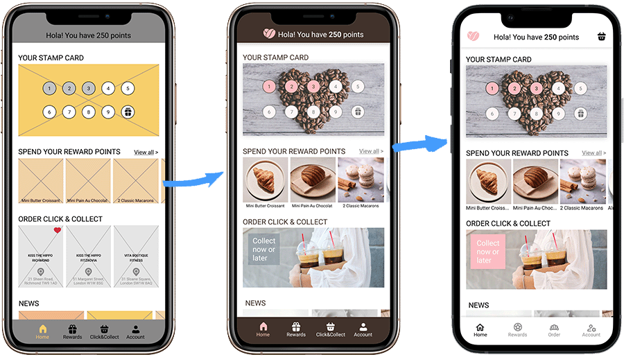
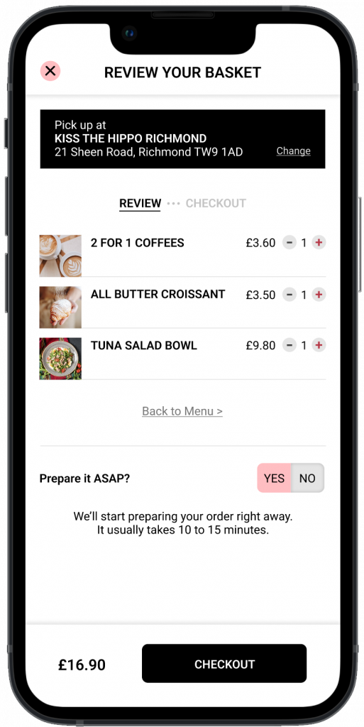
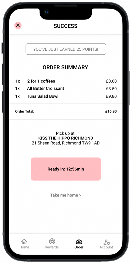
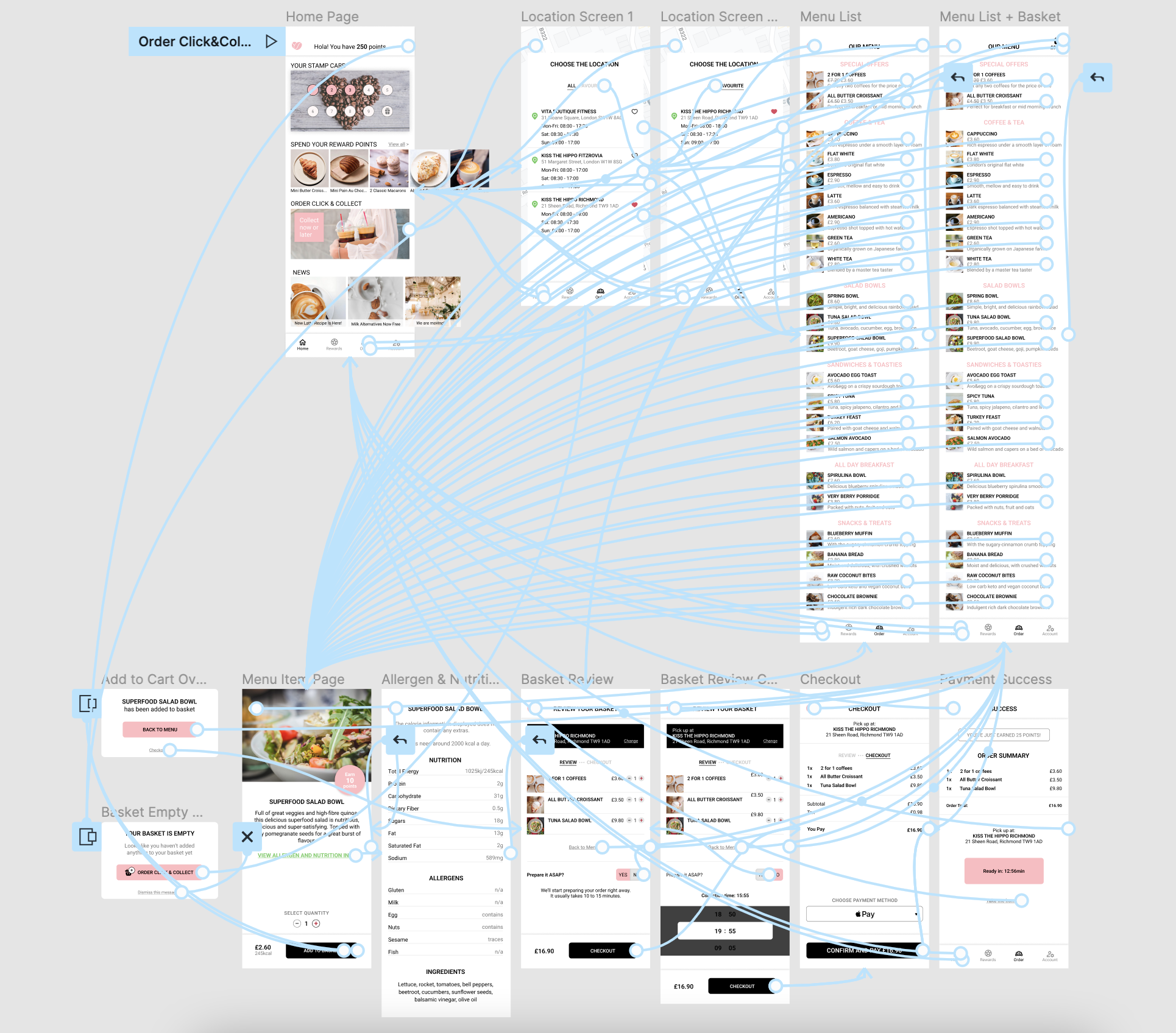
Based on my research findings and the project goals, I created paper wireframes of the home page, combining the most important elements together and establishing the basic structure of the page. The rightmost wireframe closely represents the finished result.
Digital wireframes

Since the main goal of the project was to enable customers to place advance in-app orders, I wanted to make sure the Click & Collect option is easily noticeable and accessible.

At first, I decided to let the users choose from three locations right on the home screen but I changed that later in the design process.

Main features:
  • Click & Collect option
  • Convenient digital stamp card that replaces the physical one
  • Reward programme/ability to instantly see how to spend reward points
  • Choice of locations
  • Addressing accessibility by providing an alternative pickup option for wheelchair users
A lo-fi mockup of the home screen of the coffee shop mobile app
A lo-fi mockup of the part of the order flow. The user can check a box if they are a wheelchair user and an accessible pickup will be arranged.

Usability study findings & insights

Our usability study focused on Click&Collect menu visibility and checkout flow.

  • Users need a better C&C menu visibility
  • Users need a clearer indication of unavailability of breadcrumb buttons
  • Users find the existing menu design and flow clear
  • The existing checkout process is efficient and intuitive

Refining the design: mockups

Mockup evolution. Going from a low-fi mock to a hi-fi design in two steps.

I created mockups based on the usability study findings but I was still not entirely happy with the UI.

During the iteration process I produced a lighter, more contemporary colour scheme and conducted another round of usability testing to determine if the changes had a positive impact on the user experience.

The feedback from the testing was overwhelmingly positive, with users expressing that the new colour scheme made the app feel more modern and easier to use.

Prototyping

Final thoughts

Designing for a company you know, love, and use on a regular basis was not only fun but super insightful. I am pleased with the final clean look of the mobile app and a simple, intuitive user flow. The biggest learning curve for me was understanding that accessibility is not just about meeting the needs of the disabled or catering for edge cases. Accessibility impacts everybody and has to be taken seriously from the very start of the project.

hello@olgakouneni.com

© All Rights Reserved 2024