To redesign TrackMyStack, a net worth tracking app, to deliver a more intuitive and comprehensive financial tool, improving user experience and driving better conversion rates, engagement, and retention.
My role
UX Researcher/UX Designer/UI Designer
Responsibilities
Rebranding/User research/Wireframing/Prototyping
The challenge
The app must be designed in a way that is easy to use and understand for users of varying levels of financial literacy, while providing advanced features and insights for more experienced users. Striking the right balance between complexity and simplicity is key to creating a product that is both effective and widely adopted.
Another challenge is balancing the need for innovation and creativity with maintaining the app’s familiarity and usability for existing users.
Target audience
Individuals who are interested in managing their personal finances and tracking their overall financial health. This includes people who may have various sources of income and assets, such as salaried employees, self-employed individuals, and investors.
So how might we create a more comprehensive yet intuitive net worth tracking tool for users of varying levels of financial literacy?
Understanding the user: pain points
During my user research, I conducted interviews with 16 financial app users. Through these interviews, I gained valuable insights into the pain points that users commonly experience while using financial apps. These findings helped me to better understand the needs and expectations of my target audience and informed my decisions as I worked to redesign TrackMyStack.
Data Accuracy
Users of net worth tracking apps encounter discrepancies between the data in the app and their actual financial accounts, which can lead to frustration and confusion.
Data accuracy is crucial for financial apps, as inaccurate data can skew financial projections and mislead users.
Complexity
Users often find it difficult to understand the terminology or the process for inputting financial data, which can make it challenging to use the app effectively. The complexity of the app also makes it difficult for users to navigate and find the information they need, which can lead to frustration and decreased engagement with the app.
Security Concern
Many users are concerned about the security of their financial data, particularly if the app requires access to sensitive financial accounts. They are hesitant to share this information with a third-party app and are looking for reassurances that their data is being handled securely.
After conducting extensive research into TrackMyStack’s customer base, I gained a clear understanding of the three primary customer profiles the company serves. In order to better empathise with these customers and gain a deeper understanding of their needs, goals, and behaviours, I created user personas. By using these personas as a reference, I was able to design features and experiences that were tailored to the specific needs of each customer group, ultimately resulting in a more engaging and effective product.
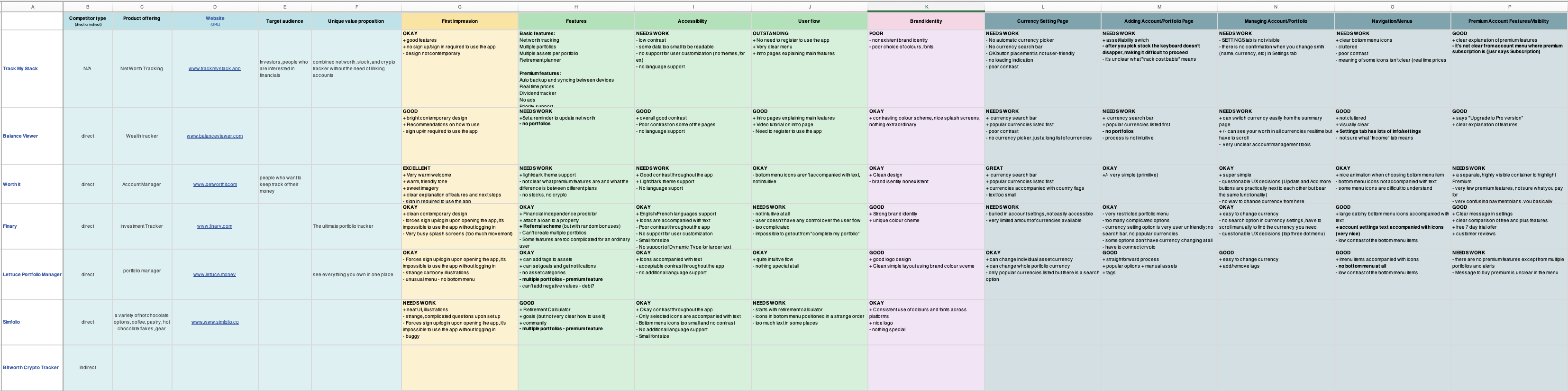
Competitive audit
In order to incorporate successful strategies from other companies into TrackMyStack, I analysed the products offered by the company’s key competitors. By identifying their strengths and weaknesses, I gained insights into what works and what doesn’t in the market. This allowed me to determine how TrackMyStack could differentiate themselves and improve upon existing solutions.
The biggest takeaways:
Successful apps tend to offer a diverse set of features that can appeal to users with varying financial needs and goals
Some of the net worth tracking apps lack simplicity and ease of use in their UX, preventing users from quickly and easily accessing key information and insights
Some net worth tracking apps integrate with other financial services or platforms, such as investment management tools or banking apps, which may raise security concerns
Most of the net worth tracking apps offer basic functionality and may be useful for individuals or households with relatively simple financial situations. However, users with more complex financial situations or investment portfolios may require more advanced features or customisation options to fully meet their needs
Information architecture
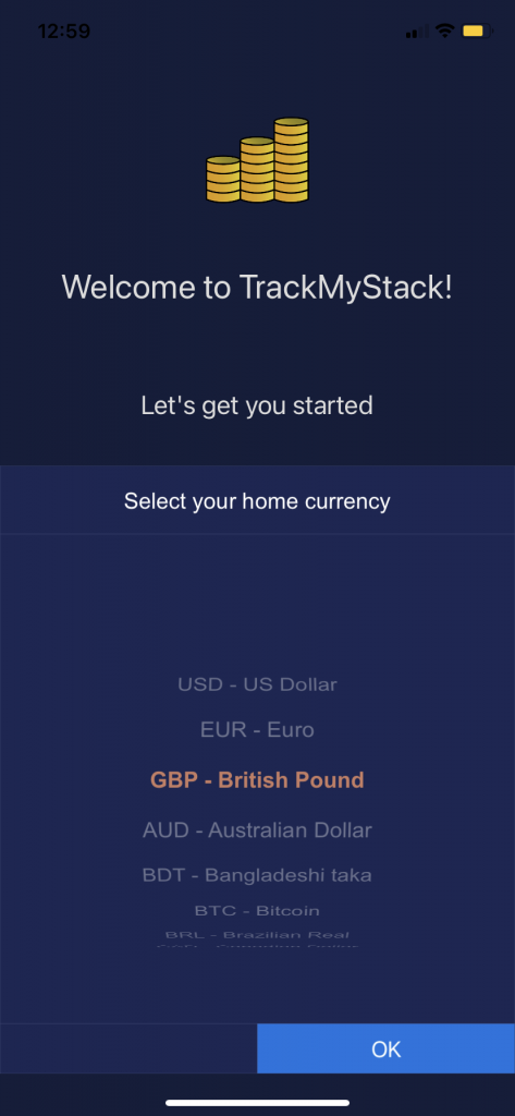
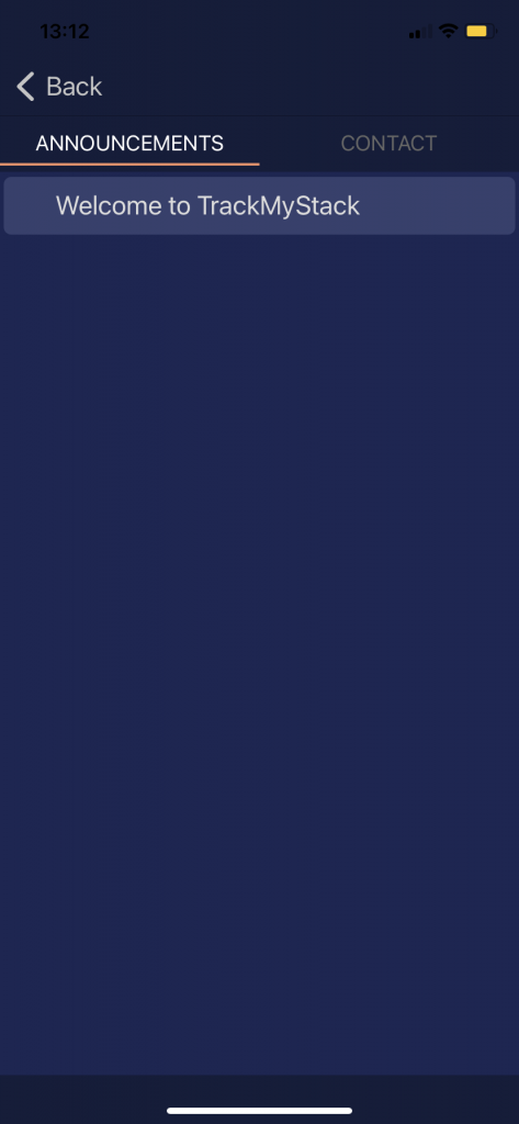
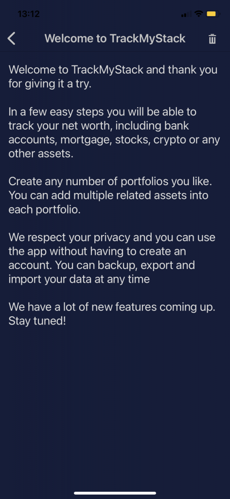
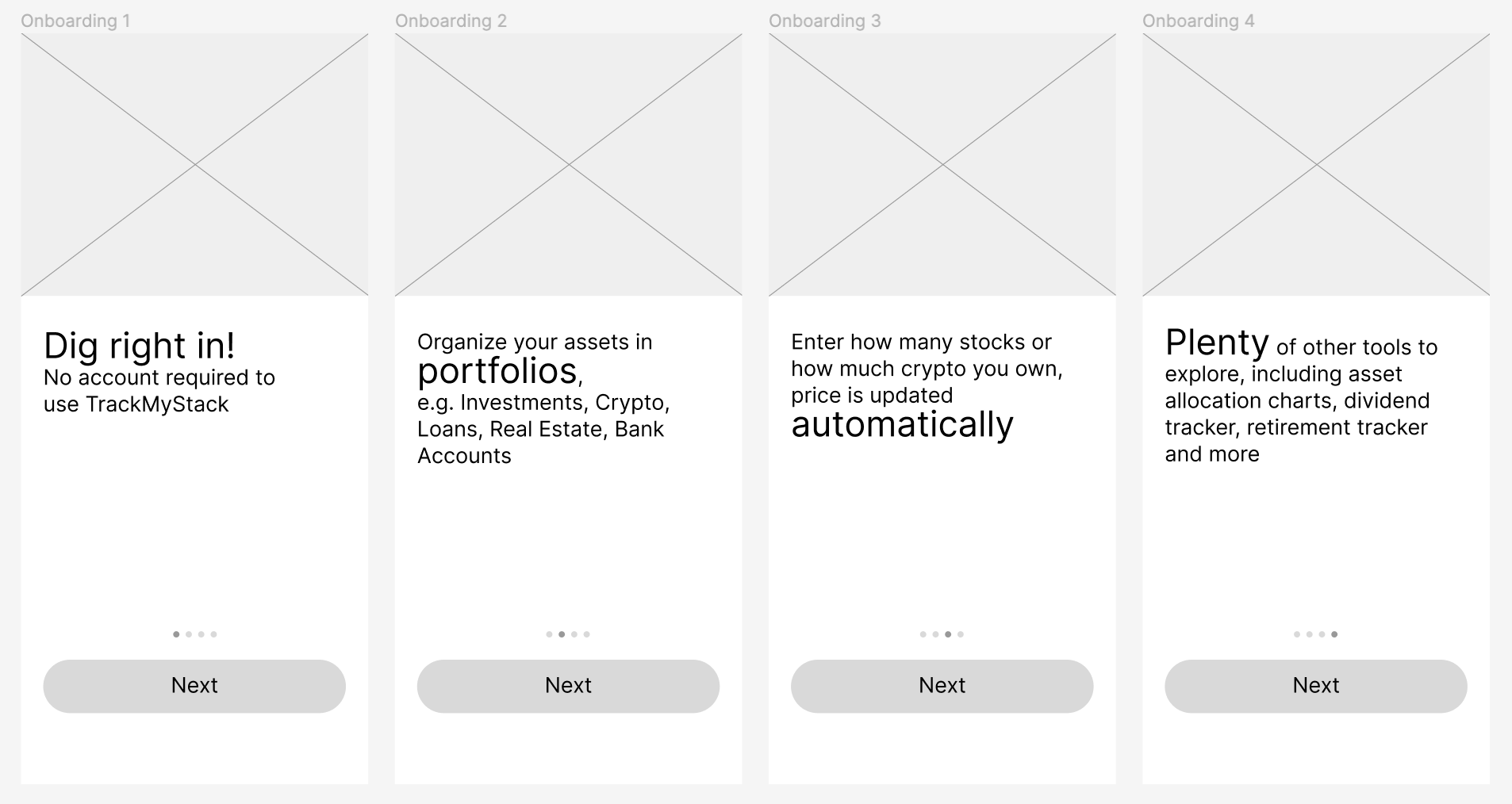
Onboarding flow improvement
As part of the app redesign project, I focused on improving the user onboarding process by adding new screens that would guide users through the app’s features and functionalities.
One of the key changes I made to the onboarding process was to highlight an important feature of the app that some users may not have been aware of: the ability to use the app without creating an account. By emphasising this feature, I aimed to reduce any potential barriers to entry and make it as easy as possible for new users to get started with the app.
Before:
The previous onboarding flow was lacking in intuitiveness and engagement, relying heavily on text without visual aids, which was creating confusion for some users
The onboarding flow I created was informed by the findings from the user research data and industry best practices.
In addition to the onboarding screens, I made several other small changes to the onboarding process to improve the user experience.
Overall, these changes helped to create a more intuitive and streamlined onboarding experience that made it easy for users to get started with the app and begin tracking their net worth.
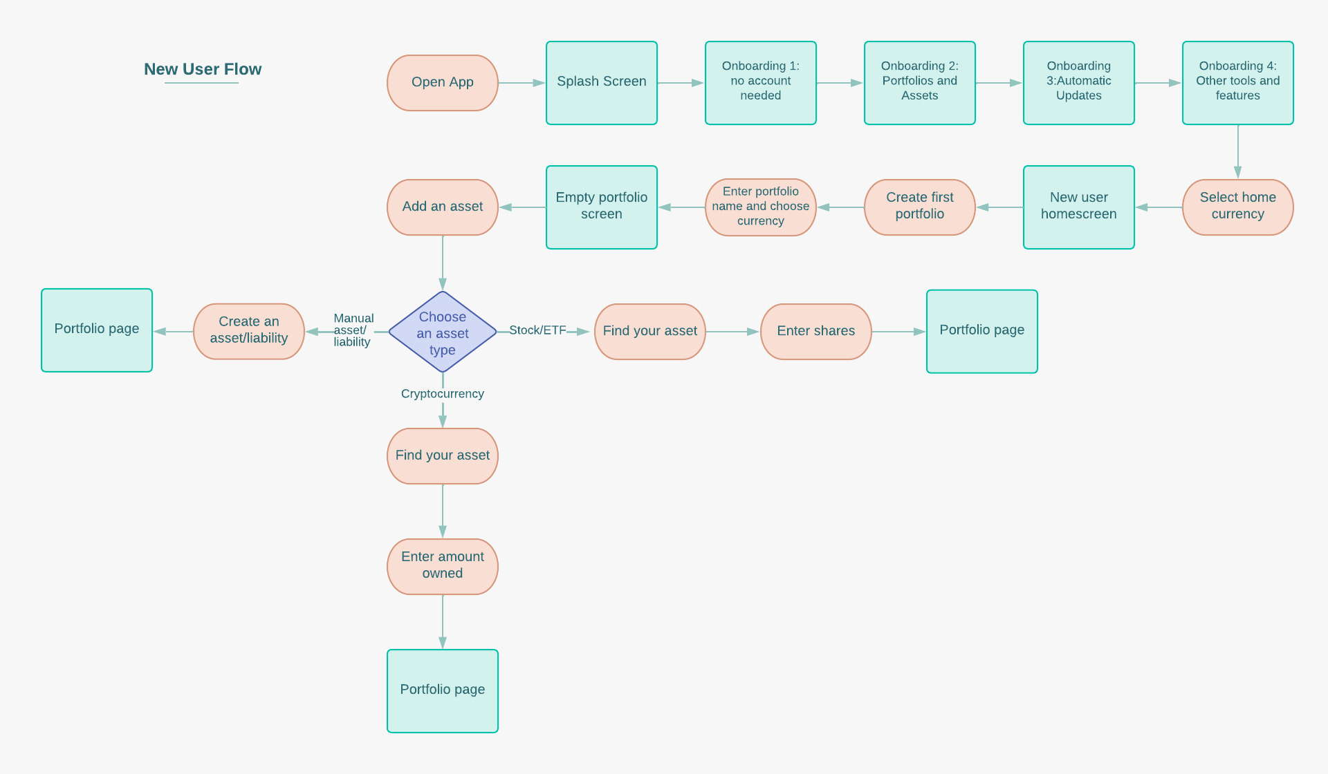
Paper wireframes
TrackMyStack is already a popular and user-friendly app, but requires optimisation and new features. To achieve this, I started with creating paper wireframes to bring together important elements of the app and introduce new user flows.
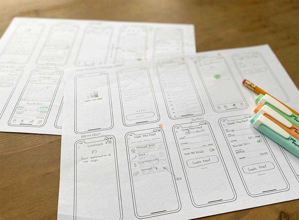
Digital wireframes
Given that the primary objective of the project was to update the app’s outdated appearance and introduce new features, I aimed to ensure a seamless integration of the new functionality with the existing one. After conducting a thorough analysis of the app’s current user flows, I proposed certain modifications that were likely to enhance the user experience.
One of the suggestions I made was to incorporate onboarding screens to help new users understand the app’s features more clearly.
Usability study findings & insights
Our usability studies focused on the updated onboarding flow.
Users were able to quickly and easily understand the purpose and benefits of the app
Users found that onboarding process and new user flow effectively communicate the app’s value proposition and encourage users to track their net worth
Some users were unsure of how to add assets to an empty portfolio
Refining the design: mockups
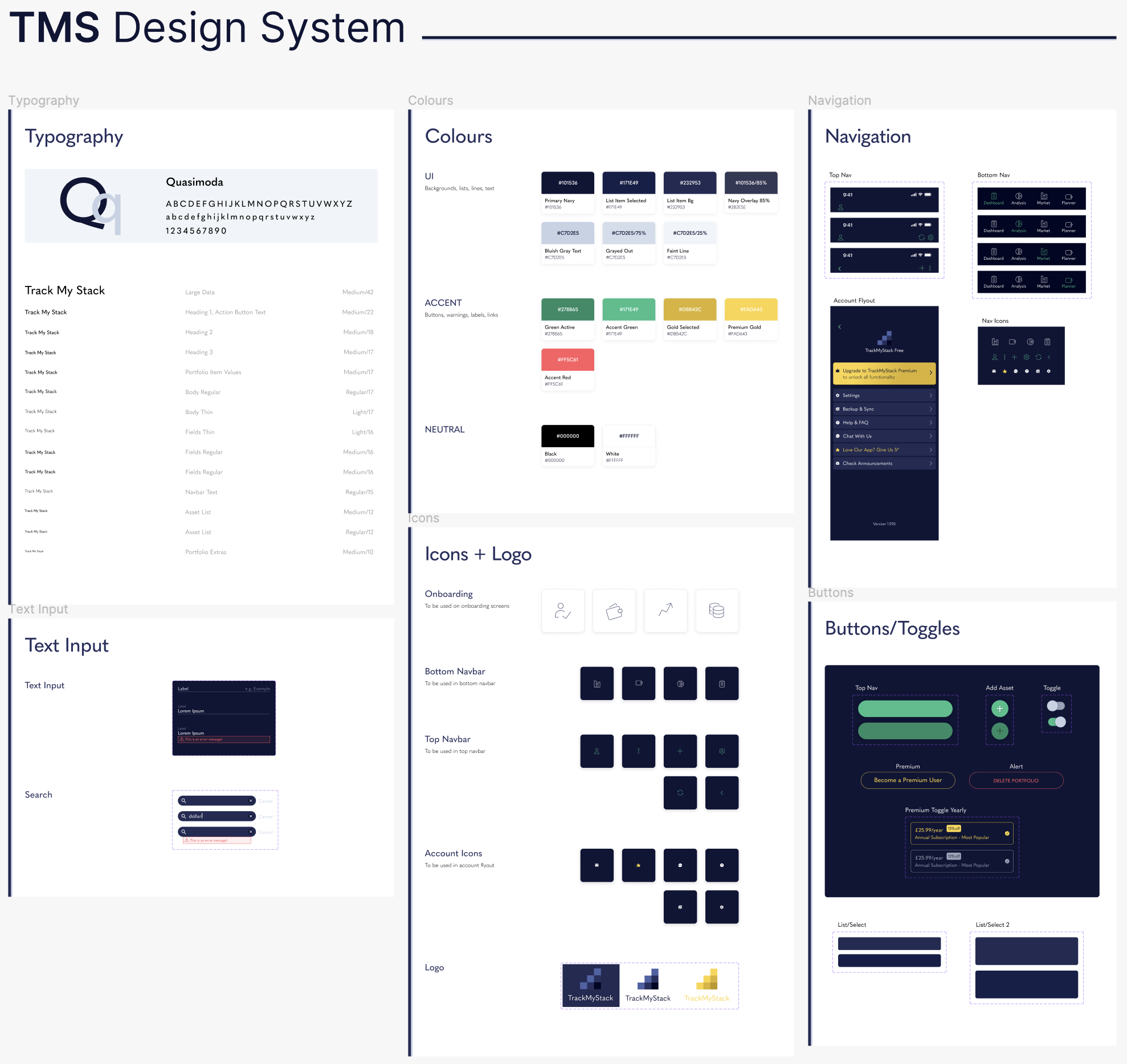
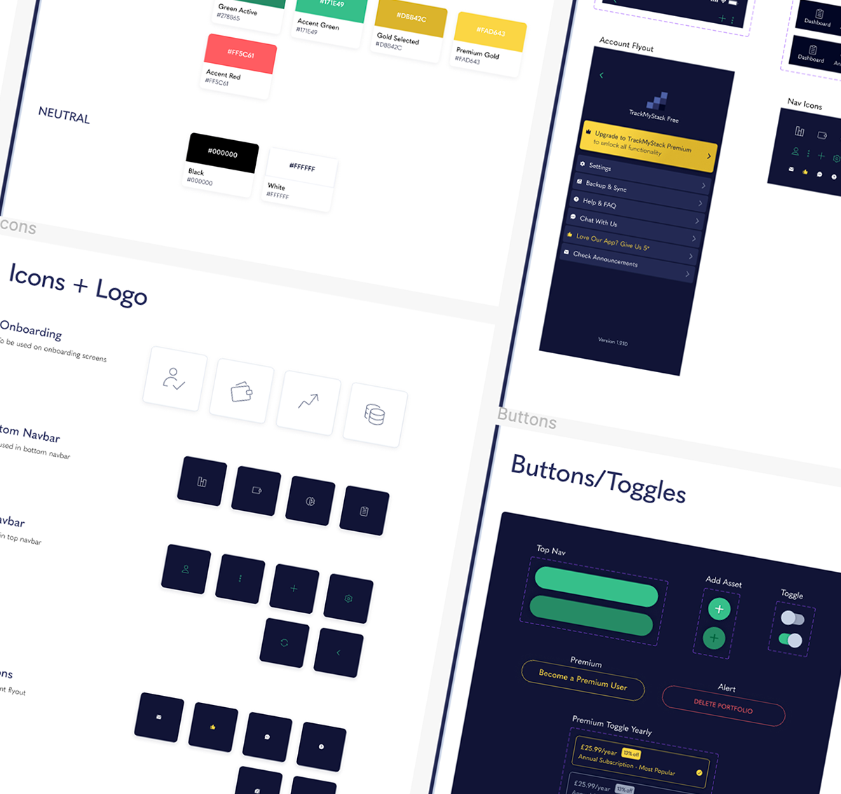
Colours
The colour scheme was updated to be more cohesive and visually appealing. The new brand design was extensively tested with the target audience to ensure that it conveyed the desired messaging and resonated with users. Overall, the refreshed brand design was intended to convey a sense of confidence and trust in the app’s ability to help users achieve their financial goals.
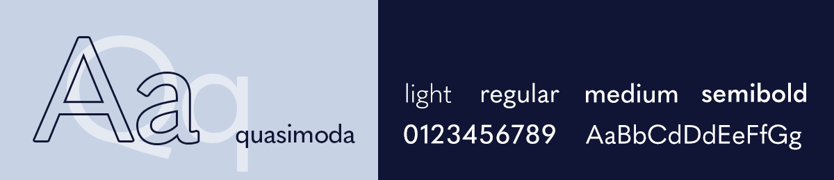
Typography
Logo
TrackMyStack logo was outdated and did not match the maturity of the brand. It was important that the refreshed brand maintained the familiarity and trust that the existing audience had with the app while also conveying a sense of modernity and relevance that could attract new users.
In the redesign process, I kept the original concept of stacked coins in mind and focused on simplifying the design.
TrackMyStack Logo Before
Redesigned TrackMyStack Logo
TrackMyStack Logo on Home Screen
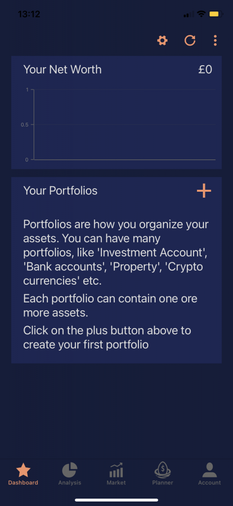
Before
cluttered and confusing top app bar, net worth is not prominent
it's unclear how a user could change chart timeframe
low contrast, cluttered main navbar
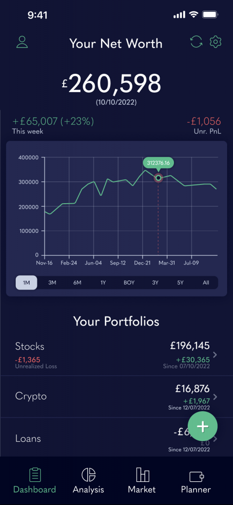
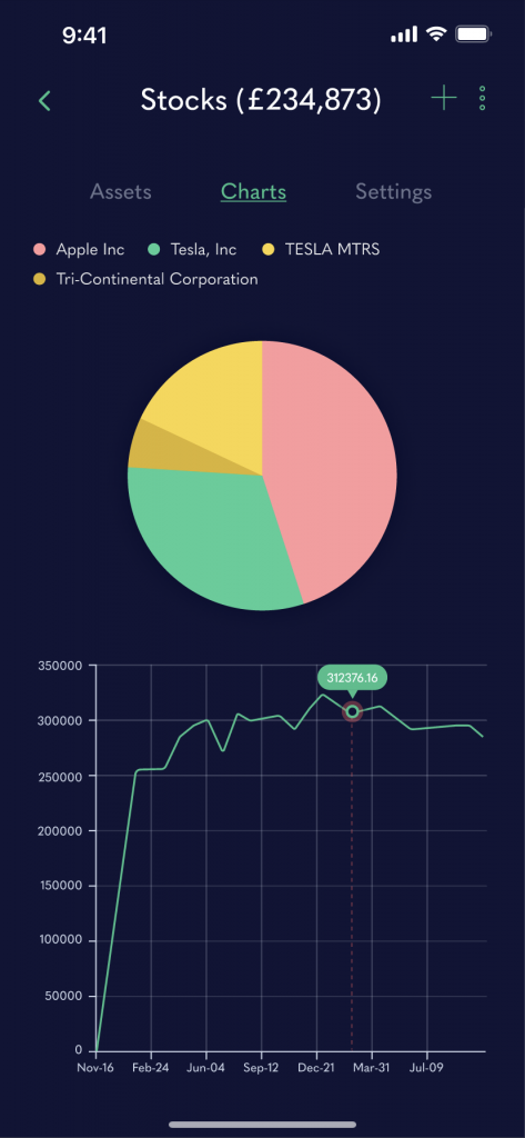
net worth is highly visible, clearer structure of top app bar
redesigned chart is more user-friendly
users can easily change chart timeframe
highly visible FAB for adding portfolios and assets
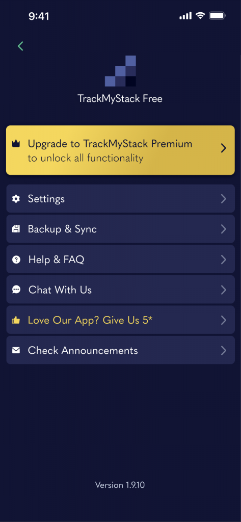
account moved to top app bar
After
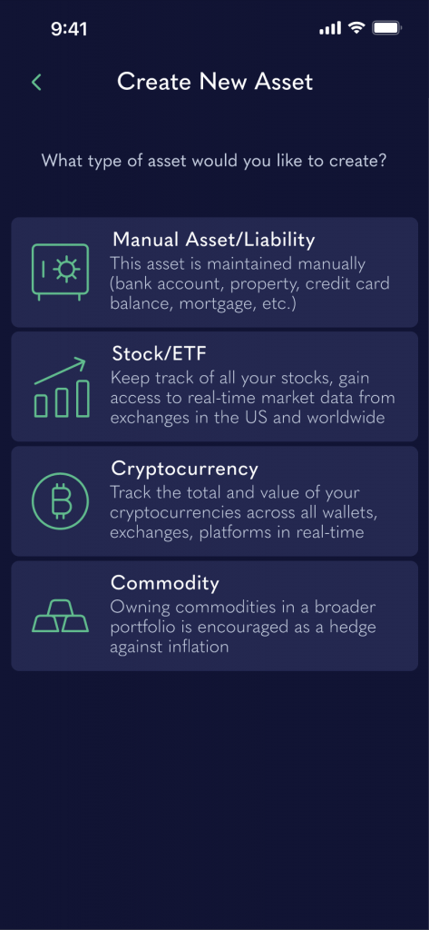
More mockups
Prototyping
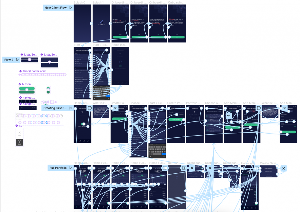
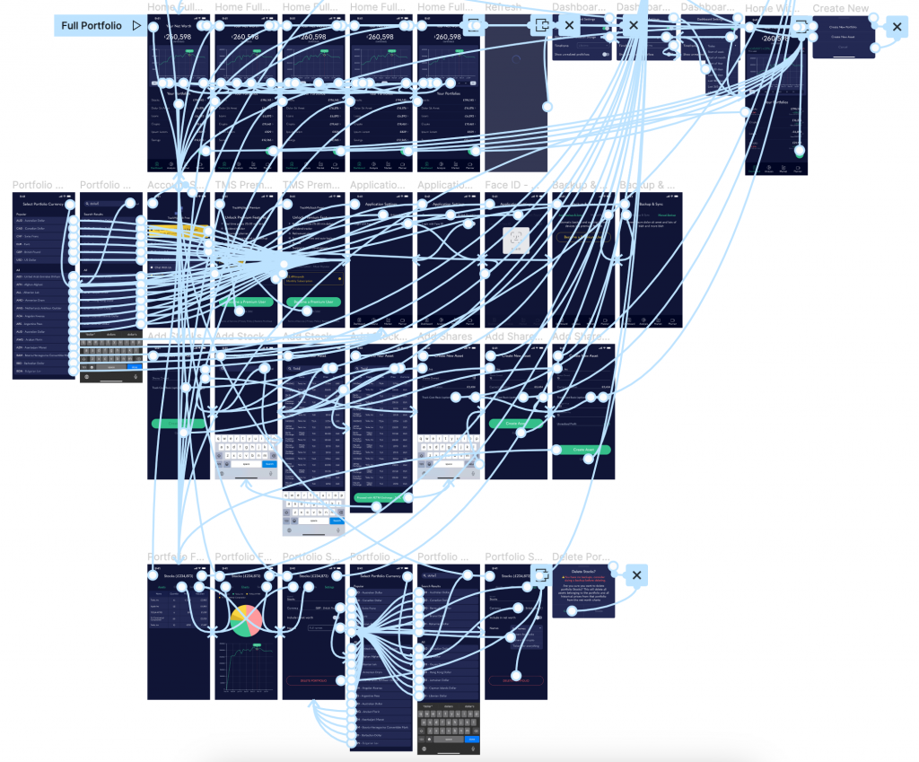
In order to test out my design concepts and ideas and get feedback before moving on to the development phase I created high fidelity prototypes using Figma’s prototyping tools. I added interactive elements such as buttons, input fields, and transitions to make the prototypes feel like a functional app.
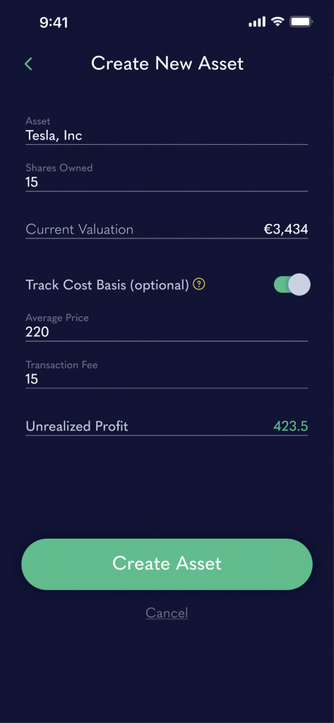
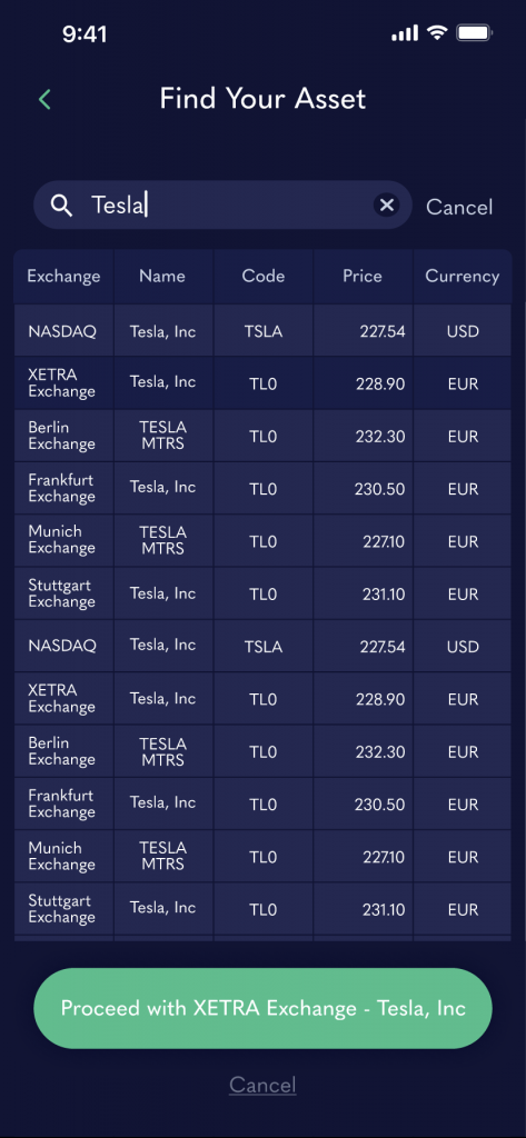
Below are screenshots of just two out of dozens of the app’s user flows.
Impact
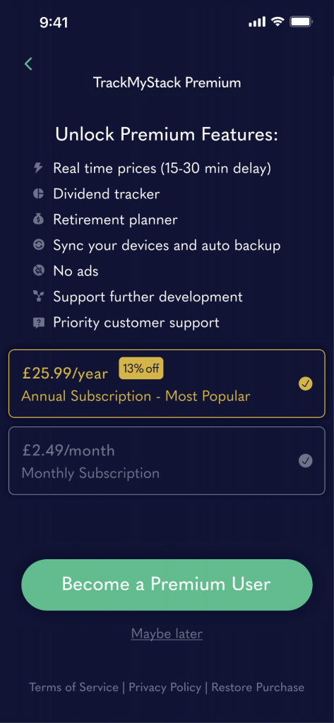
300%
increase in conversions to premium accounts
94%
increase in 90-day retention rate (34% to 66%)
270%
increase in the number of daily active users (DAU)
Hear it from the users
Vic G
Read More
Best free Net Worth tracker. Intuitive and Detailed.
Silindokuhle Jay
Read More
I'm in love with this app, motivates me to grow my wealth and show my holdings in real time. Plus the no need for signing up 👌🏽
123gango
Read More
Brilliant! Well worth the sub. I love the new look and sync feature.
David Foster
Read More
If you want to go from broke to wealthy, try this app. It will provide you with your overall financial picture so you can work on tackling any financial issues you have. It is very easy to use.
Previous
Next
Final thoughts
Redesigning a popular net worth tracking app has been an incredibly insightful and rewarding experience. I was presented with a unique opportunity to work on a project that impacts a large number of users and has the potential to make a significant impact on their lives.
Working on such a project requires deep understanding of user needs, behaviour, and pain points. It also involves analysing massive amount of data to identify trends and patterns to inform design decisions.
The biggest challenge for me so far has been balancing the need for innovation and creativity with maintaining the app’s familiarity and usability for existing users.